Website · 2026
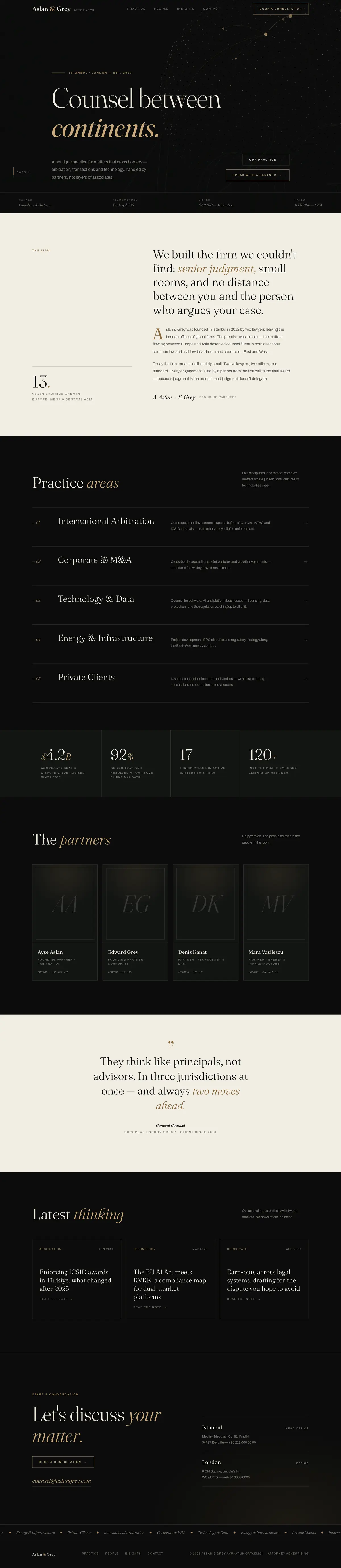
A premium web experience for a boutique law firm
Role
Concept Case Study — Art Direction + Design + Development
Stack
Programs Used
Law firm websites are stuck between two clichés: gavel-and-scales stock templates, or corporate brochures with nothing to say. For Aslan & Grey — a fictional boutique firm based in Istanbul + London, focused on cross-border arbitration and M&A — the question was: how does a legal site communicate trust and prestige like a luxury brand, without falling into cliché?
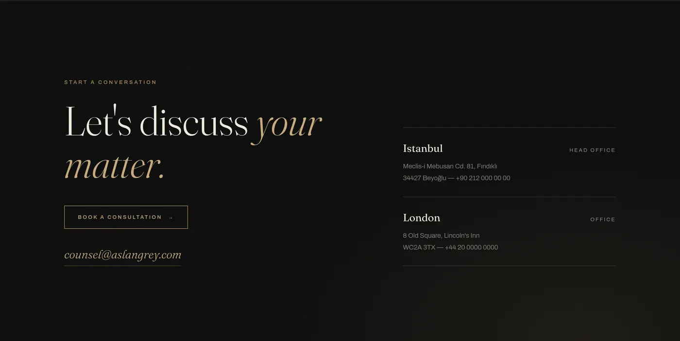
I started by analyzing legal and professional-services sites on Mobbin: the strongest examples were dark, cinematic and typography-first. The art direction grew from there — ink-black ground, ivory text, bronze accents and the italic voice of the Fraunces serif. The 'counsel between continents' concept is visualized in the hero with Three.js: a bronze particle globe with light arcs connecting Istanbul, London and Dubai. The experience layer is woven with GSAP ScrollTrigger + Lenis: a letter-by-letter preloader, a word-by-word scrubbed manifesto, a scroll-velocity-reactive marquee, magnetic buttons, 3D-tilt partner cards and a custom cursor.
Market Research
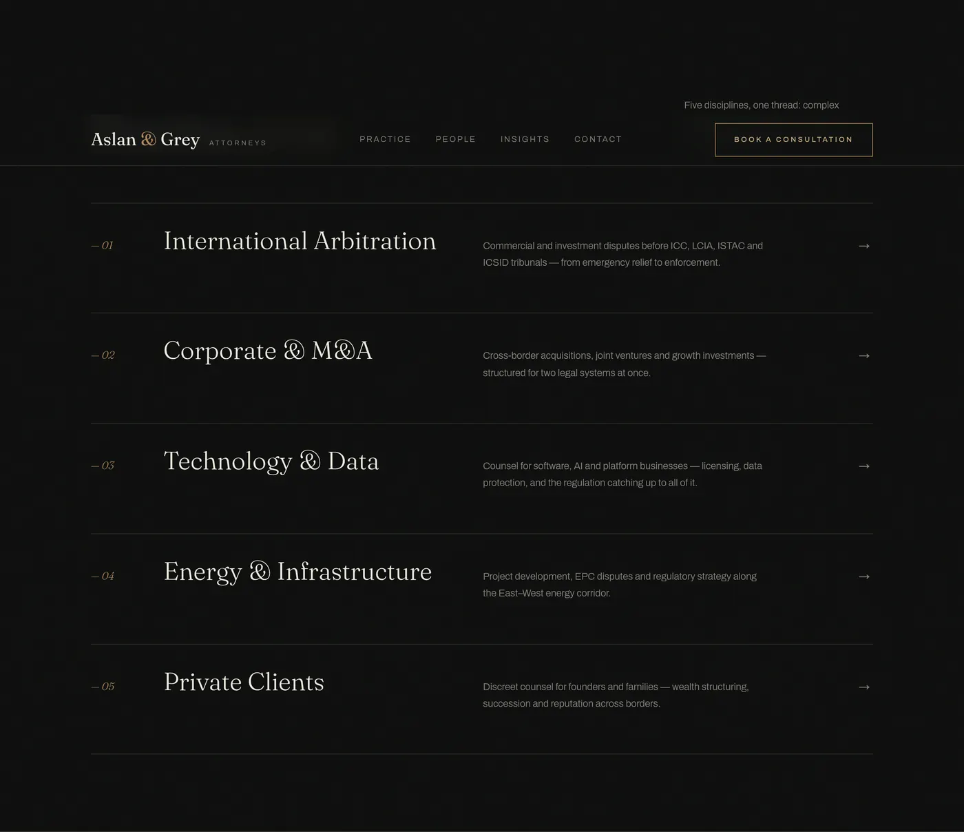
Scanned legal, finance and studio sites on Mobbin: dark cinematic heroes, numbered service indexes, monochrome portrait grids and hairline stat bands emerged as the strongest patterns.
Brand & Art Direction
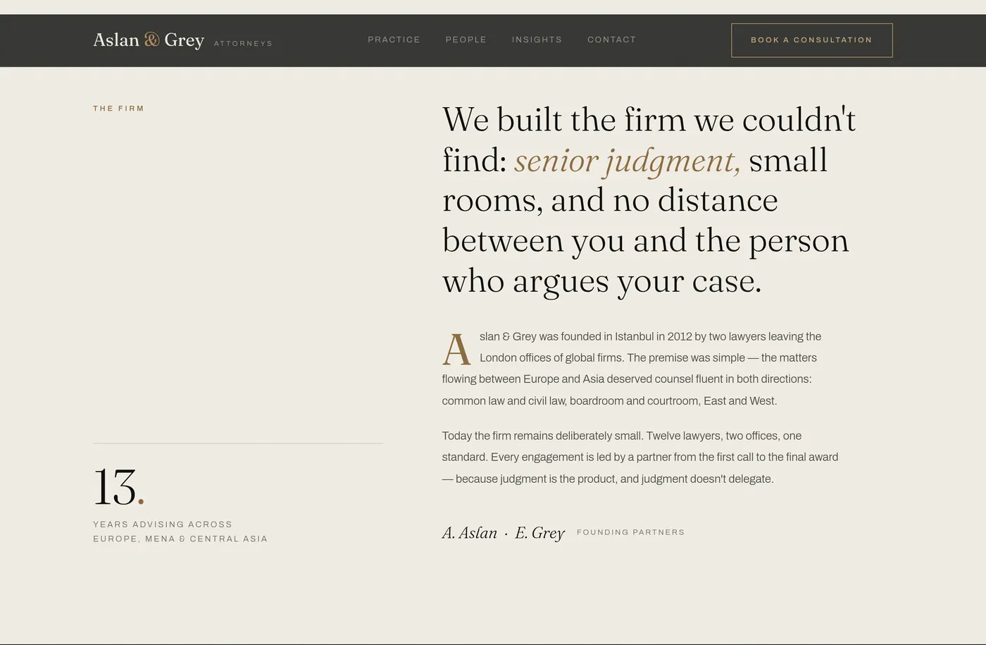
It began with the name: 'Aslan & Grey' — Turkish + English, sitting between two cultures exactly like the firm. The palette is ink + ivory + bronze; the typography pairs Fraunces italics with Archivo's letterspaced labels.
Concept Visualization
The 'counsel between continents' line became a Three.js particle globe in the hero: 1,600 fibonacci-distributed points, bezier light arcs between cities, mouse parallax and a scroll-driven exit.
Motion & Micro-interaction
Choreography built on GSAP ScrollTrigger + Lenis smooth scroll: a preloader counter, word-scrubbed manifesto, velocity-reactive marquee, magnetic buttons, 3D-tilt cards, a custom cursor and film grain.
Building a language of prestige in legal without stock photos or gavel clichés — through typography, space and a single concept visual
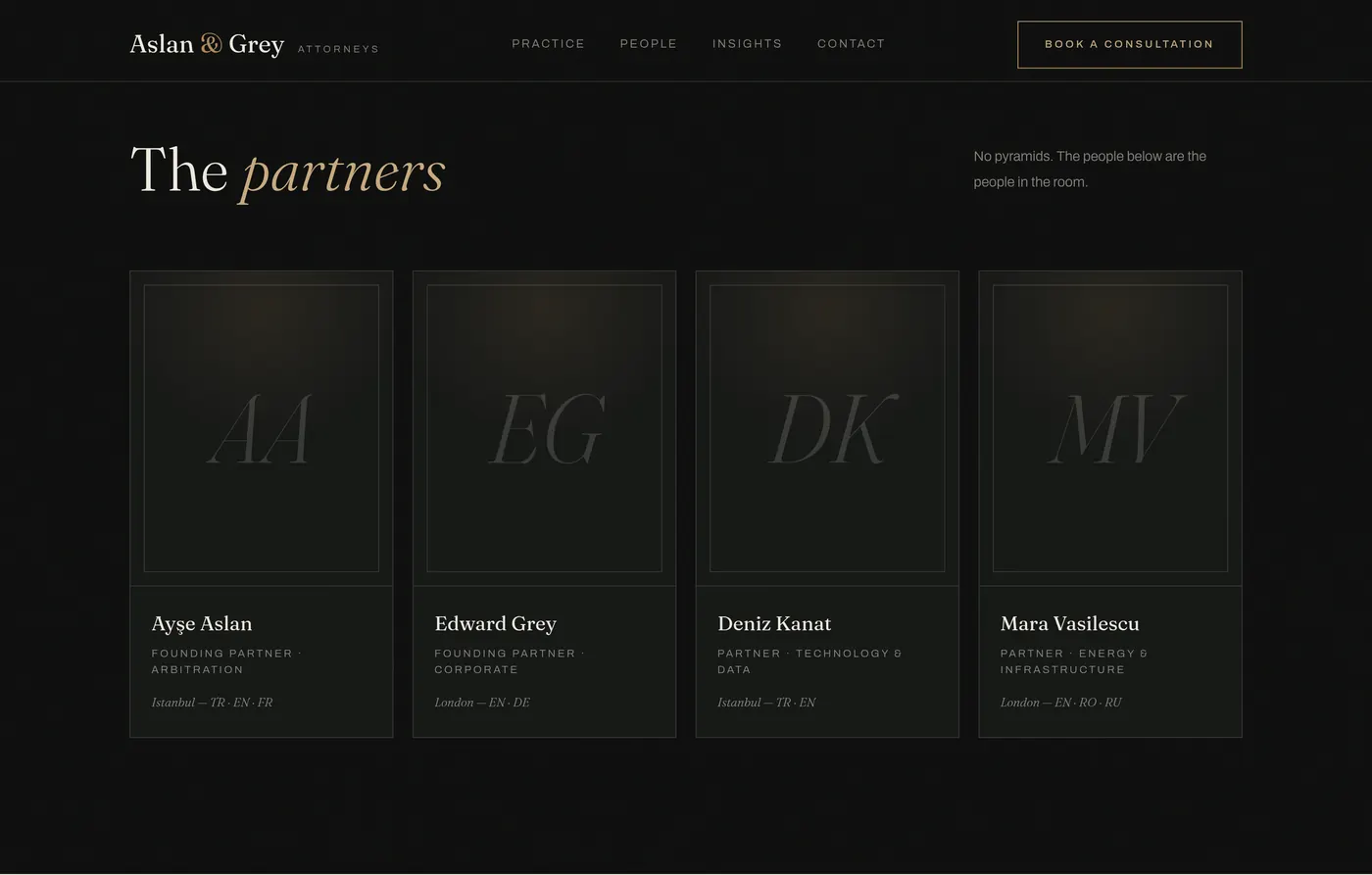
Designing a team section with zero photography: engraving-like monogram cards that read as intentional, not placeholder
Balancing Awwwards-density motion with corporate gravity — every animation slow, weighted and drawn from a single easing family

What This Project Taught Me
“Luxury comes from what you remove, not what you add. On Aslan & Grey the hardest calls weren't what should move — but what should hold still.”
A single-file, framework-free prototype: a digital experience with Awwwards aesthetics that keeps the gravity the legal sector demands. A numbered practice-area index, a hairline stats band and engraving-like monogram partner cards — a language of prestige without cliché.